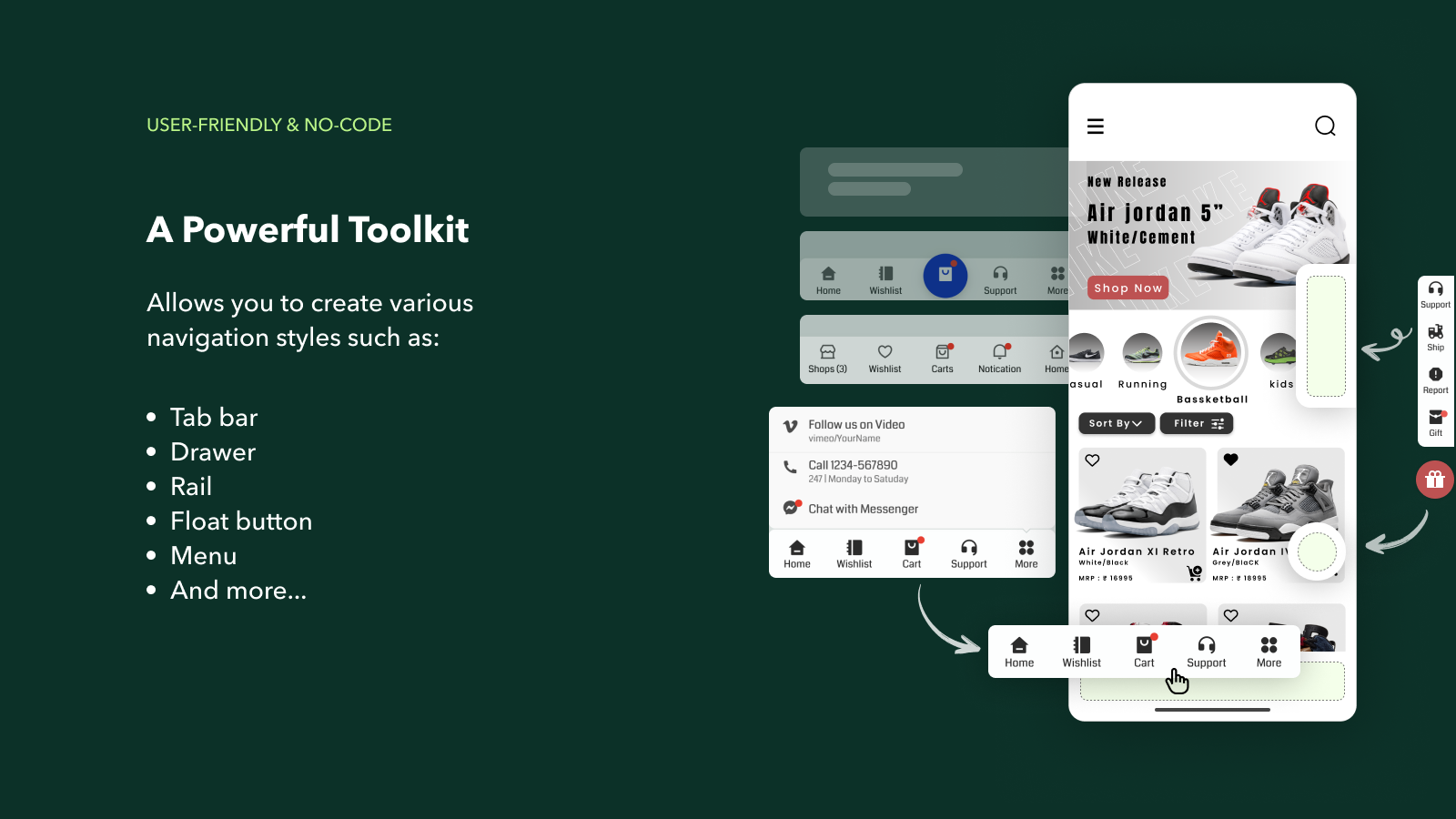
Introducing the new app on Shopify: Pro Navi - Navigation design, used to create bottom bars, float buttons, drawers, and more for your website.
This is a powerful and user-friendly toolkit that enables you to create various navigation styles such as Tab bar, Drawer, Rail, Float button, and Menu, catering to each user's specific needs. Why? Because navigation is the most important aspect of a website? Similar to intelligently organizing shelves and pathways in a supermarket, customers will easily make purchase decisions aligned with business goals.
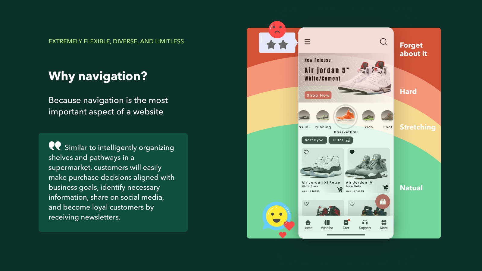
Why Pronavi? Because navigation is the most important aspect of a website?
Similar to intelligently organizing shelves and pathways in a supermarket, customers will easily make purchase decisions aligned with business goals, identify necessary information, share on social media, and become loyal customers by receiving newsletters.
Pronavi Highlights
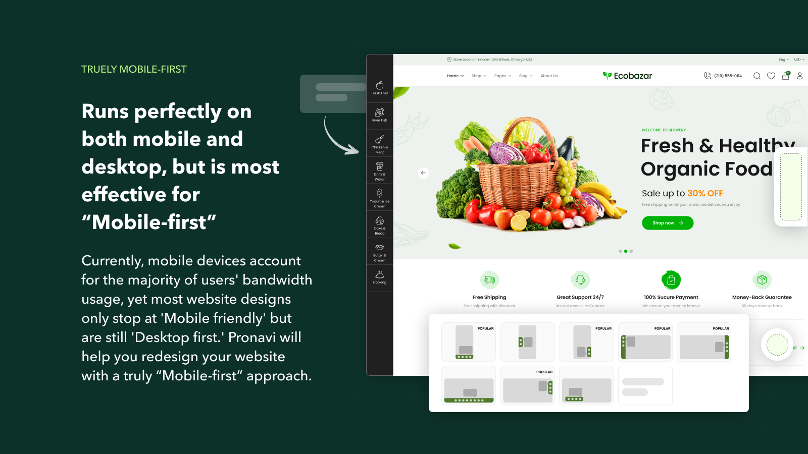
Runs perfectly on both mobile and desktop, but is most effective for “Mobile-first”
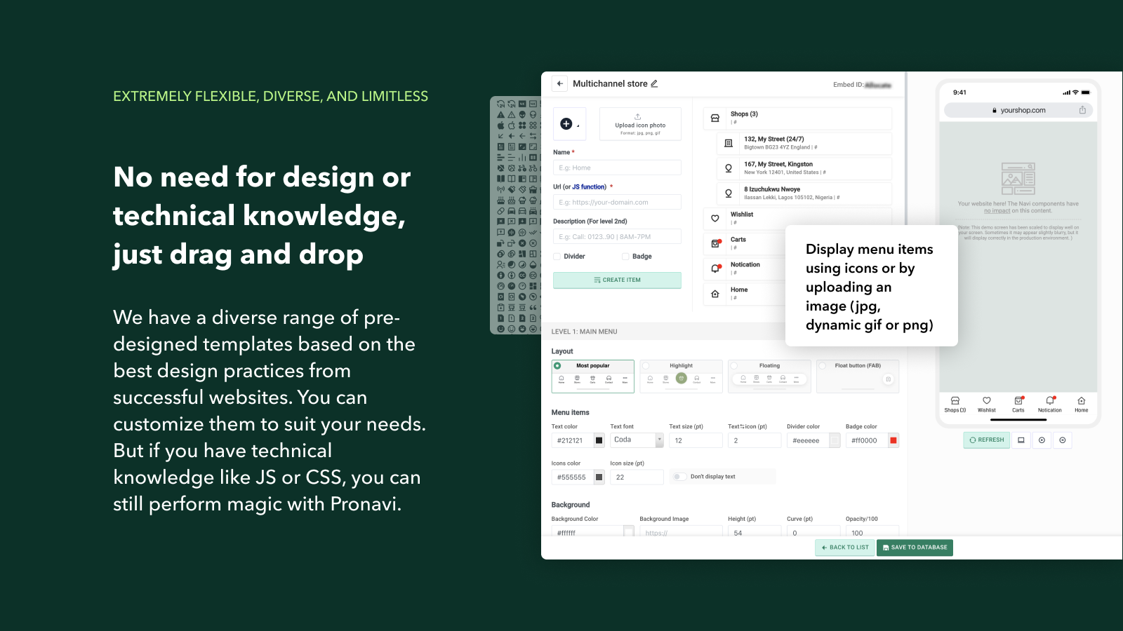
Extremely flexible, diverse, and limitless
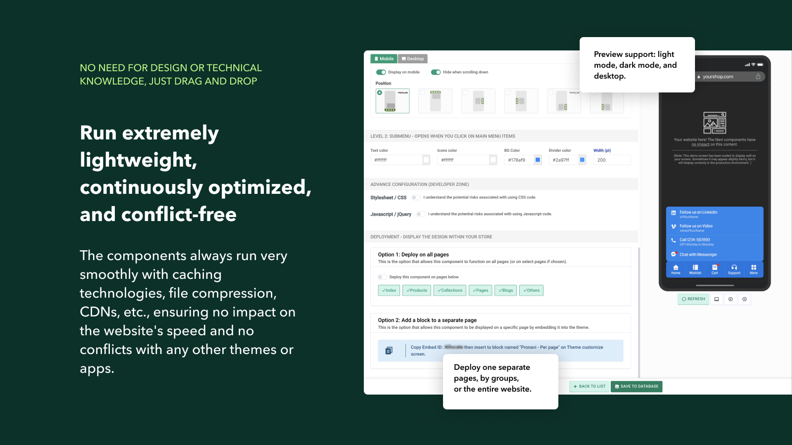
Run extremely lightweight, continuously optimized, and conflict-free
Daily measurement, user understanding, and easy A/B testing
No need for design or technical knowledge, just drag and drop
Free still performs well until you truly need a higher version
Pricing
Starter: FREE
Lifetime usage
Up to 2 components
Unlimited kinds of controls
Unlimited feature usage
High-quality infrastructure (99.00% SLA)
Email Support
BUSINESS: $4.99
Everything in Free
Unlimited components
Maximize speed
Embedding CSS and JS
Image uploads (JPG, PNG, dynamic GIF)
Data Analysis
24/7 Support
How to start: Really easy
Step 1: Design
Click on "Add new component" or edit from the sample components we have already created, and design the content, linkages, and styles for the component as you desire. Pay attention to the display on both mobile and desktop because the presentation on these two platforms is different.
Step 2: Deploy
Option 1: Deploy on all pages. This is the option that allows this component to function on all pages (or on select pages if chosen)
Option 2: Add a block to a separate page. This is the option that allows this component to be displayed on a specific page by embedding it into the theme. Copy the Embed ID of component then insert to block named "Pronavi - Per page" on Theme customize screen.
Demo video
Start now: https://apps.shopify.com/pronavi-navigation-design
Comments
Join the discussionNo comments yet. Be the first to comment.