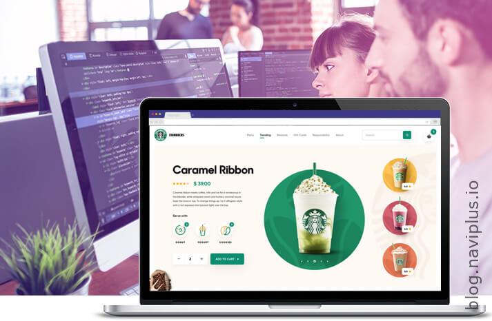
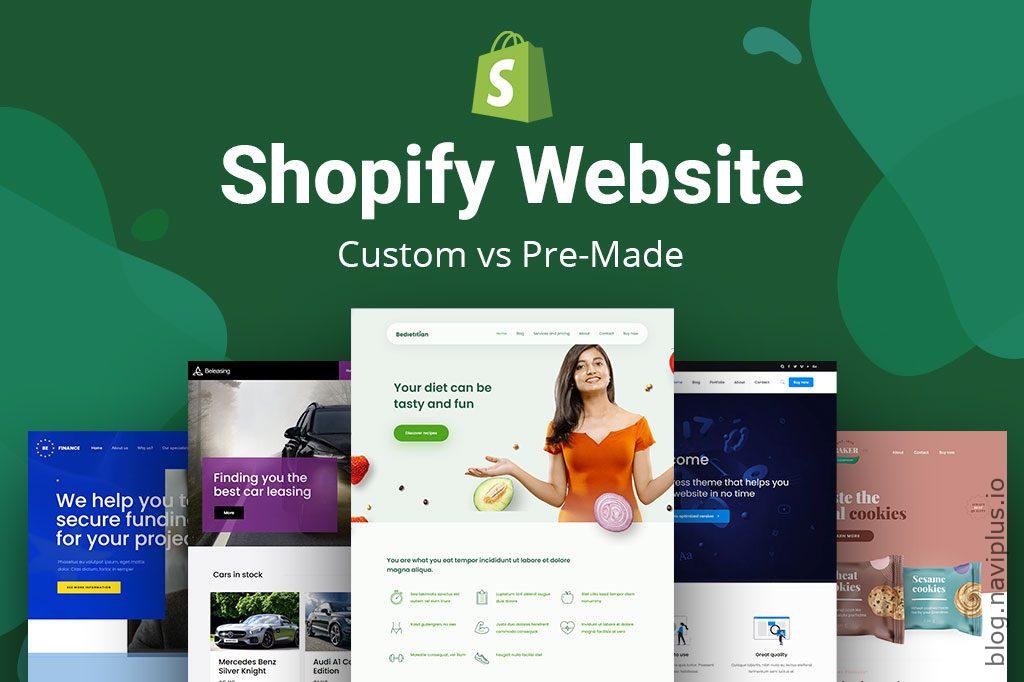
9 Tips to improve your Shopify store design 2024

Tip 1: Simplify Shopify Navigation
Make it easy for customers to find what they’re looking for by creating a clear and concise navigation menu. Simplify Shopify Navigation is a crucial tip for improving the design of an e-commerce website. This involves creating a clear and concise navigation menu on a website or application. The aim is to make it as easy as possible for customers to find what they’re looking for.
Table of Contents
A well-structured and simplified Shopify navigation system can significantly enhance the user experience. It eliminates the frustration of not being able to find desired products or services, leading to increased customer satisfaction. Proper navigation should include clearly labeled categories, a search bar, and a logical flow from general content to more specific content. This allows customers to navigate through the website with minimal clicks, improving the overall efficiency of the site and potentially increasing conversion rates.
In essence, simplifying navigation is about providing a seamless and straightforward browsing experience for customers, which is key to the success of an e-commerce platform.
When it comes to implementing navigation on your e-commerce website, it’s important to consider the technical aspects.
Firstly, ensure your site’s architecture is well-structured; all pages should be logically organized and accessible through a minimal number of clicks from the homepage. A common practice is to implement a breadcrumb trail, helping users understand their location within the site.
Next, think about the UI/UX design. Shopify Dropdown menus and mega menus can be useful for sites with a large number of categories or subcategories. However, ensure these are easy to navigate and don’t overwhelm the user.
Also, consider implementing a search function with autocomplete and filters. This can help users find what they’re looking for more quickly, especially on larger sites.
Finally, ensure your site is responsive, meaning the navigation adjusts to different screen sizes and devices. This is important as more and more users are shopping on mobile devices.
Remember to continually test and refine your navigation based on user feedback and analytics data.
Tip 2: Use High-Quality Images
To effectively display your products, it is of utmost importance to utilize high-resolution images. By doing so, you ensure that the potential customers can clearly see the details of your products, thereby creating a more engaging and immersive shopping experience. High-quality images can significantly enhance the perceived value of your products, making them more enticing to your audience. To take high-quality images for your website, follow these steps:

Use a Good Camera: Invest in a decent camera. DSLR and mirrorless cameras are excellent options. You can also use a smartphone with a high-quality camera.
Lighting is Key: Good lighting can make a significant difference in your photos. Natural lighting is often the best choice, but if it’s not available, use soft lighting equipment. Avoid harsh lights which can cause shadows and overexposure.
Use a Tripod: A tripod can help you avoid blurry images and allows for consistent framing if you’re taking multiple photos.
Choose the Right Background: The background should not distract from the product. Use a plain or neutral background.
Focus on the Product: Make sure the product is in focus. If your camera has manual focus, learn how to use it.
Take Multiple Shots: Take photos from multiple angles and distances to give users a thorough view of the product.
Post-Production: Use photo editing software like Adobe Photoshop or Lightroom to correct colors, adjust brightness and contrast, crop, and add any necessary touches.
Remember, practice makes perfect. Over time, you’ll learn what works best for your products and brand.
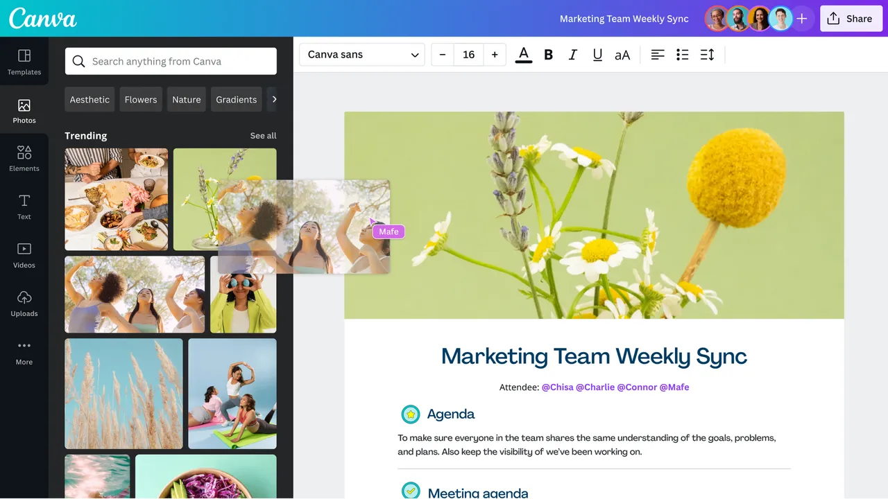
Some tools to create quality images for a website
Adobe Photoshop: This is a popular tool for editing and creating high-quality images.
Canva: Canva offers a variety of templates and design elements for creating attractive images.
Snappa: This tool is excellent for creating social media graphics, blog images, and more.
Lightroom: A product of Adobe, perfect for editing and enhancing photographs.
Figma: A cloud-based design tool that is great for collaborative work.
Tip 3: Optimize Shopify for Mobile (very important)
It’s crucial to ensure that your website not only looks appealing but also functions seamlessly on mobile devices. In today’s digital era, a large number of consumers prefer to shop using their mobile phones due to the convenience it offers. Therefore, optimizing your site for mobile use can significantly enhance the user experience, driving more traffic and potentially boosting sales.
Mobile web is more important than desktop for several reasons:
Increasing Mobile Users: The number of mobile users has surpassed the number of desktop users worldwide. People are increasingly using their smartphones to browse the internet and shop online.
Convenience: Mobile devices allow users to access the internet wherever they are, at any time. This convenience means users are likely to spend more time browsing and shopping on their phones.
Mobile Commerce Growth: Mobile commerce, or m-commerce, is growing rapidly. More and more consumers are making purchases directly from their smartphones, making it crucial for e-commerce websites to be optimized for mobile.
SEO Benefits: Google uses mobile-first indexing, which means it looks at the mobile version of your site for indexing and ranking. A well-optimized mobile site can help improve your SEO and increase your visibility in search results.
Shopify User Experience: A well-designed mobile website can provide a better user experience. It’s important to ensure your website is easy to navigate on a small screen and loads quickly to keep users engaged.

To optimize your mobile web, do the following:
Responsive Design: Ensure your site has a responsive design that automatically adjusts to fit the screen size of the device the customer is using.
Mobile-Friendly Navigation: Your site’s navigation should be just as intuitive on a mobile device as it is on a desktop. Consider using a hamburger menu to conserve space.
Touch-Friendly Buttons and Links: Buttons and links should be large enough to be easily tapped with a finger without zooming in.
Optimize Images and Videos: Compress and optimize your images and videos to reduce load times without sacrificing quality. Consider using adaptive or responsive images that change size based on the user’s screen.
Eliminate Pop-Ups: Pop-ups can be annoying and difficult to close on mobile devices, potentially increasing bounce rates.
Test on Multiple Devices: Regularly test your site on various types of mobile devices to ensure compatibility and a good user experience.
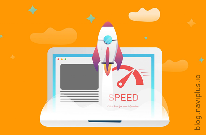
Tip 4: Improve Site Speed
If your website takes too long to load, it can create a frustrating experience for your visitors, potentially causing them to leave and never return. Therefore, it’s crucial to optimize your website’s loading speed. A faster site not only improves user experience but can also boost your ranking in search engine results. With the right optimization strategies, you can make your site load quickly, keeping your visitors engaged and increasing the chances of them becoming repeat customers.
How to Begin Improving Your Website Speed
To start improving your website speed, follow these steps:
Minimize HTTP Requests: Reduce the number of HTTP requests by combining files, such as CSS and JavaScript files, and using CSS instead of images whenever possible.
Enable Compression: Use software like Gzip to reduce the size of your CSS, HTML, and JavaScript files that are larger than 150 bytes.
Enable Browser Caching: By enabling browser caching, you allow portions of your site to be stored in a cache, or temporary storage space. This means for return visitors, your site will load more quickly.
Reduce Image Sizes: Compress your images and use the correct file format to reduce the size of your images without losing quality.
Use a Content Delivery Network (CDN): CDNs distribute your content across multiple geographic locations. A user’s proximity to one of these locations can significantly speed up their loading times.
Optimize CSS Delivery: Move CSS to the top of your HTML document to speed up rendering time.
Prioritize Above-the-Fold Content: Include just enough CSS, HTML, and JavaScript to load the top of the page first, improving perceived loading times.
Reduce the Number of Plugins: Each plugin requires resources to run, and more plugins mean more resources. Evaluate your plugins and remove any unnecessary ones.
Use Asynchronous Loading for CSS and JavaScript Files: By doing this, some files will load simultaneously, speeding up page load times.
Tip 5: Consistent Branding
Consistent branding is more than just aesthetics – it’s about communicating your brand’s values and mission through every aspect of your site. This includes the tone of voice in your copy, the style of your images, and even the user experience of your site. Consistently reflecting your brand throughout your site can help build a strong connection with your audience and foster loyalty.
Tip 6: Easy Checkout Process
In order to combat high cart abandonment rates, it’s crucial to simplify the checkout process. Make it as straightforward and user-friendly as possible to prevent customers from leaving their carts midway. Minimizing the number of steps to complete a purchase, providing multiple payment options, and ensuring the process is fast and seamless can greatly contribute to reducing cart abandonment rates.

Here are some strategies to simplify the checkout process:
Guest Checkout Option: Not all customers want to create an account just to make a purchase. By providing a guest checkout option, you can cater to these customers and reduce the barrier to completing a purchase.
Clear Progress Indicators: Let your customers know where they are in the checkout process. This can be done by using a progress bar or clearly stating the steps. This can help reduce the anxiety associated with not knowing how long the process will take.
Multiple Payment Options: Offer multiple payment options to cater to the preferences of different customers. This includes credit/debit card payments, PayPal, Apple Pay, Google Pay, and other popular payment methods.
Save Customer Information: If customers have an account with you, save their information to make future checkouts faster and easier. This includes shipping addresses and payment information.
Security Seals: Reassure customers that their information is safe by displaying security seals during the checkout process. This can increase trust and conversion rates.
Free Shipping: Many customers abandon their carts due to high shipping costs. If possible, offer free shipping to reduce the overall cost for the customer.
Easy to Edit Cart: Make it easy for customers to review, edit, and even save their cart for later. This gives them the flexibility to change their mind without having to start over.
Clear Return Policy: Having a clear, easy-to-find return policy can reassure customers and make them more willing to complete their purchase.
By implementing these strategies, you can simplify the checkout process and reduce cart abandonment rates. This can lead to increased sales and customer satisfaction.
Tip 7: Use SEO Best Practices

To enhance your website’s visibility, it is essential to optimize your content and meta tags for search engines. The optimization process involves creating high-quality and relevant content that aligns with what your target audience is searching for. Alongside this, the proper use of meta tags, which provide concise information about your web page to search engines, plays a significant role in improving your site’s search engine rankings. By doing so, you can increase your website’s visibility and attract more visitors.
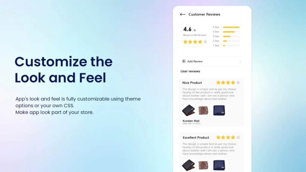
Tip 8: Implement Customer Reviews:
Customer reviews, the firsthand experiences and opinions of individuals who have already purchased and used a product or service, serve a vital role in e-commerce. By providing what is referred to as ‘social proof,’ these reviews can reinforce or challenge the claims made by a company about a particular product or service. Potential buyers often rely heavily on these reviews to inform their decision-making process. Reading about the experiences of others can give them a better idea of what to expect, thereby providing a level of assurance before they commit to a purchase.
Tip 9: Leverage Social Media Integration
It’s crucial to incorporate social media sharing buttons directly on your product pages. This simple yet effective strategy can significantly increase the overall visibility of your products. When customers share your products on their social media platforms, it creates an opportunity for their followers to engage with your brand. This could potentially lead to higher traffic on your website, greater customer engagement, and ultimately, increased sales. Implementing social media sharing buttons is an easy way to create organic growth and awareness for your brand.